I think it would be a good idea if we, as a community had a brainstorming session for ideas that we'd like to see incorporated into the new look theme for the site.
Personally I'd like to see us opt for a single, timeless design that represents Game of Thrones as a whole, rather than have a skin based on promotional material from Season 4 that will just end up being changed next year. The Harry Potter wiki have recently done something similar to what I have in mind... like an old book with parchment pages. UESP.net is another good example of this look. What does everyone else think?-- 15:49, August 7, 2014 (UTC)
Well as I said on the Talk for the mainpage I tried loading up a sloppy copy of a new one last night: just a mock design so we can switch away from those damned fish-eyed faces with their dead stares. This should have been updated when Season 4 began.
I am unfamiliar with loading skins onto wikis however. So I attempted to just copy the basic proportions of the old one and put in new images. However it didn't seem to load...though now in the photos section I notice that Staffer Grace has loaded up the image I did yesterday:
My idea was just to make it "Ice and Fire": "Ice" images of the Wall storyline on the left, firey images on the right. Of course I could only fit so many images in (unless someone else can figure out how to make a better montage of smaller images)...
So I went with, on the left, "Ice" being that epic shot of Stannis's large cavalry force charging in front of the Wall itself....while for "Fire" I used images of a burning Stark flag from the Red Wedding, plus the iconic shot of Robb Stark's desecrated corpse with the wolf's head stuck onto it.
But this was just to "get the ball rolling"...--The Dragon Demands (talk) 16:45, August 7, 2014 (UTC)
I agree that HP Wiki's look of black text on a brown/tan background, to make it look like parchment, is a good idea for the main section itself.
We tried using transparent sections in early Season 3 I think, and I don't remember it working out too well; it became difficult to read.
Still I think the sidebars should be separate images (as they are now), wideshots and the like to give the illusion of depth (as opposed to these closeup character shots).--The Dragon Demands (talk) 16:48, August 7, 2014 (UTC)
I'd go with a single, iconic image, like the Wall or the Iron Throne. A single image, not a collage. Or the dragon silhouette background we had before the faces staring at you, which now looks weird.--Gonzalo84 (talk) 16:54, August 7, 2014 (UTC)
If we only use one image of the Wall, I'd recommend a shot of the Battle of Castle Black (probably the well-lit Stannis army one) because then we get lots of stuff in one image.--The Dragon Demands (talk) 16:57, August 7, 2014 (UTC)
Oh crud, the new skin I loaded kicked in, and it appears that I got the proportions all wrong. The left-hand Stannis army at the Wall image only covers the top half, as does the right hand set of images.
On the old one, we only saw two poster-heads on each side even though there were four in the main graphic, so I only set it up to be about half-sized thinking it would display similarly. I will need to reload a better placeholder image. Something like a White Walker on the lower left, and dragons on the right. Do we have a good shot of either? Preferably a better shot of Drogon breathing fire on those goats?--The Dragon Demands (talk) 16:57, August 7, 2014 (UTC)
Another possibility would be a map of Westeros or the Known World. I'm adamant against collages. Despite the quality of the images they look a bit amateurish. I'm say that because in my teens I did some Buffy collages. --Gonzalo84 (talk) 17:05, August 7, 2014 (UTC)
I'd be for a map of Westeros, but I'd prefer the Iron Throne. Maybe half of the Throne on the left side of the page and half on the right side? DRAEVAN13
17:10, August 7, 2014 (UTC)
I agree with Gonzalo about collages not being a good idea. Unless we can get one of the graphic designers at Wikia to make one where the images are blended together... that may be cool. I was also inclined to suggest the map of Westeros... until I remembered that the lamentable Ice and Fire wikia uses the same image. I'm not sure if there are other official HBO maps apart from that one?-- 17:28, August 7, 2014 (UTC)
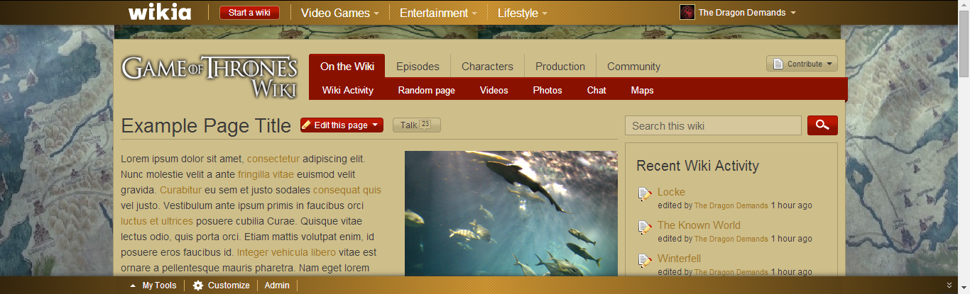
Okay I've updated my placeholder skin, this should work for the time being:
Well Draevan13....why not use the in-universe map? That the characters use and which Jim Stanes drew up? We'd need good and well-lit screenshots.--The Dragon Demands (talk) 01:40, August 8, 2014 (UTC)
Request for help
Hi everyone. I'm Joe from Wikia. QueenBuffy just posted a request on the ComDev request page for a new background, and when I came here I noticed this discussion, so I thought I'd drop by.
I've been making background images for Wikia communities for several years now, and I do agree that choosing a timeless, iconic image that accurately represents the topic is a good idea. In response to the fact that Ice and Fire Wiki already uses a map of Westeros, if you do want to use a map, you could use a Westeros map that looks different to the one they're using, such as this one. Of course, the Iron Throne is certainly iconic, so displaying half of it on one side and half on the other side of the page is always another option.
Feel free to continue the discussion, and I'll keep watching it. Once a decision has been agreed upon, I'll be happy to make the new background. JoePlay(talk) 18:44, August 8, 2014 (UTC)
THE MAP THE MAP!!! I love it! We've done the chair before, but the map would be new and with the new Map features on Wikia, it seems fitting. What do you guys think?? QueenBuffy 19:50, August 8, 2014 (UTC)
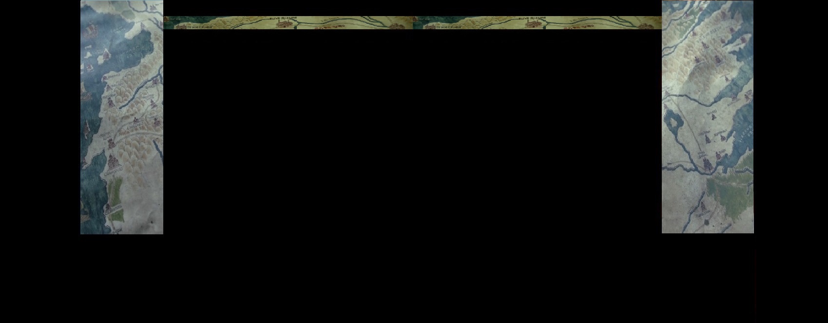
Well I suggest using the in-universe map that Stanes made. Let me find some screenshots of it on here...
It's one map and they re-use it a lot (though it unfortunately doesn't contain Dorne because it was made in Season 1, Dorne is off the edge). (As for color layout I'm tired of these cold blue colors, I liked TheBoy's idea of a parchment-color background with black text; also red icons to be wax-seal-like.--The Dragon Demands (talk) 22:53, August 8, 2014 (UTC)
They sell this map over at the HBO shop; here's a (badly colored) image of the full thing:
Normally we only see parts of it when people are pointing at it. Let me find some other HD screenshots...--The Dragon Demands (talk) 22:56, August 8, 2014 (UTC)
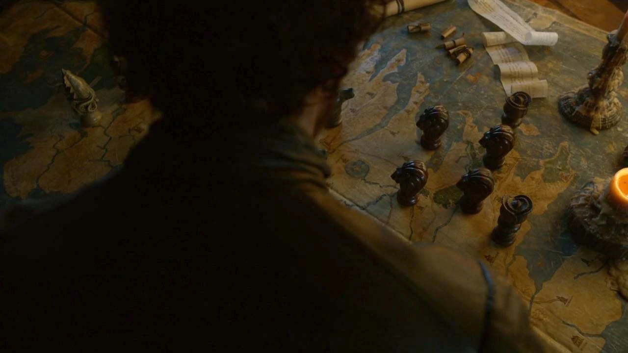
Okay they did later add Dorne to the bottom of the map in Season 3; only shot I have at the moment though is over Robb Stark's shoulder and with map markers all over it (showing that post-Battle of the Blackwater, with Stannis's armies crushed, the Lannister-Tyrell alliance has overrun the mainland Stormlands):
I like example 1. The first one! QueenBuffy 23:30, August 8, 2014 (UTC)
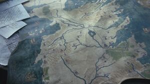
Ack, sorry I got distracted by a phone call. Here's what I think is the best version we have, an HD screenshot of the map Maester Luwin uses in his geography lesson in Season 1 episode 5 "The Wolf and the Lion". (Notice that Dorne has been "accidentally" cut off the edge, because they didn't want to introduce it really early and deluge viewers with too many names, because they were still learning who the "Starks" and "Lannisters" were -- but as you saw they add the Dorne part in by Season 3).
Is the map you linked to an official one, Joe? If not we probably wouldn't be able to use it. I like the first one The Dragon suggested, it's clearer than the third one... although it doesn't show as many locations. I think regardless of which image we use a portion of it will be cut off, so the bits that are visible need to be as legible as possible. I think as long as people can recognize it as a map of Westeros, and can read it we should be okay. Does anyone else have any thoughts on the rest of the design? I think if we go with my parchment idea we should use a lighter shade than the Harry Potter Wiki... more like UESP.net. I also like The Dragon's idea of having the links, buttons etc in dark red to look like wax seals. That would look really cool.-- 08:54, August 9, 2014 (UTC)
Oh no the third one is a high definition file, you can zoom in for the good parts...let me make some cropped versions...--The Dragon Demands (talk) 16:02, August 9, 2014 (UTC)
I like it! I would suggest changing the deep red of the task/tool bar to a deep blue perhaps? But other than that, I am for it! Want me to let the staff know? QueenBuffy 20:12, August 9, 2014 (UTC)
New color scheme
The color changes went into effect immediately: I changed the link color to a blue variant, because the brown text on tan background was kind of difficult to read.
I want the links to be the exact same blue hue as the "buttons" are, but the theme designer doesn't give that option; I searched the rgb color code from "inspect element" to find the hexidecimal equivalent to plug in - but it's not quite the same shade of blue.
Can someone help change the "links" hexidecimal color to the exact same blue shade that the "buttons" use?
I wanted it to be red wax on parchment, but "red links" signify dead links on the internet, so that might be confusing. Well, the letter Catelyn got from the Eyrie in Season 1 had a blue was seal for Arryn...--The Dragon Demands (talk) 01:18, August 12, 2014 (UTC)
The new background looks amazing, though I'm not too keen on the chocolatey color scheme. Perhaps I had gotten used to the gray-blue we've used for the last two years. How would a color scheme reflecting the "ice and fire" them would look? Grey background and red links.--Gonzalo84 (talk) 01:43, August 12, 2014 (UTC)
Thank you for darkening the links.
You're welcome. You can see them better now. Just wish I knew how to make my damn signature "crown" image not show up in the activities page. lol QueenBuffy 02:00, August 12, 2014 (UTC)
...Gonzalo84 said he thinks its too "chocolate-y" and a bit difficult to read. Thoughts on this?
I don't know what "ice and fire" would look like with text colors....red on light blue looks kind of odd.--The Dragon Demands (talk) 01:55, August 12, 2014 (UTC)
Chocolate-y. lol. Hmmm, well, it is tan. Not sure what else I could do, it matches the map pretty well, what did you have in mind? Lighter? QueenBuffy 02:05, August 12, 2014 (UTC)
BTW... the infoboxes still have the grey background.--Gonzalo84 (talk) 02:06, August 12, 2014 (UTC)
Yes, once we pick a color scheme we need to adapt the infobox backgrounds to match it.--The Dragon Demands (talk) 02:07, August 12, 2014 (UTC)
I don't really care for all the different shades of blue on the main home page. They aren't really that cohesive looking to me. Idk, what it is. Maybe the main headlines, are too "teal"..and need more dark blue in the middle of them? Maybe darken the cast portal box a smidgen? QueenBuffy 02:11, August 12, 2014 (UTC)
Keep the grey background, a lighter or bluer shade to reflect the "ice" (and steel) and red for fire.--Gonzalo84 (talk) 02:12, August 12, 2014 (UTC)
...something vaguely along these lines?:
...needs adjusting. But admittedly black text on light blue/grey is a lot easier to read than black against tan like we have now.--The Dragon Demands (talk) 02:26, August 12, 2014 (UTC)
K. Let me tinker with it. QueenBuffy 02:29, August 12, 2014 (UTC)
Ok, cooler tones. What about this? QueenBuffy 02:35, August 12, 2014 (UTC)
I like this one. Though if you think its a little too dark, lighten it up a shade.--Gonzalo84 (talk) 02:57, August 12, 2014 (UTC)
Yeah!--Gonzalo84 (talk) 03:20, August 12, 2014 (UTC)
The background is amazing, but I think we need more cohesion in the rest of the design. We have pale blue pages, with gold headers, red buttons, dark blue links, plus the turquoise graphics and portals on the main page... it's just too busy. Seeing as we're settled on the background why don't we take our cues from that and make the whole skin based on a map with subtle shades of blue and green? Ice and Fire is a good idea in theory, but seeing as we're not using it in the background graphic it doesn't make much sense, as visitors are unlikely to make the association, and will just see lots of clashing colors.-- 07:43, August 12, 2014 (UTC)
What about this sort of coloration for the articles?-- 08:47, August 12, 2014 (UTC)
Alright guys, I can't keep changing the colors! lol. I do like the green too, so lets just take a quick vote.
New background looks awesome, nice work everyone. Prefer the red/brown look I think but they both look good to me.Esnifador (talk)
Once we decide on that color, we can have someone maybe fix the front page headlines/words from the more teal blue to something that matches better, as well as the cast portal color. QueenBuffy 14:33, August 12, 2014 (UTC)
The pale light blue was giving me eyestrain attempting to read it. I'm now trying out a darker (but still more or less light) blue, from the preset choices, which is actually easier to read for me (at least).
My new idea was that instead of trying to make it look like "ice", was to try to make the blue of the background match the blue of the oceans on the map (more or less).
I also tried using white letters on navy blue background (vaguely similar to our older black on dark almost-black motif) but this looked kind of garish.
The skin itself is fine now, what we need to figure out is the color scheme. And the overriding concern (I realize in hindsight) is how easy it is to physically read.--The Dragon Demands (talk) 00:34, August 13, 2014 (UTC)
We badly need to neutralise one of these colors, so I've changed the Wikia tool-bar to black, which I think looks much better. I've also made the task bar and buttons a slightly darker shade of red. The links should be darker too, I think. That being said I don't... hate it. I still think the tan color The Dragon choose the first time around was perfect, and would look even better with the black and very dark red.-- 10:23, August 13, 2014 (UTC)
I don't care for the dark blue background or the black toolbar (not a very warm color), but yeesh guys, we'll obviously never agree, so I don't know what to do. Doesn't matter if we all just keep changing it to our own liking. QueenBuffy 14:14, August 13, 2014 (UTC)
Well we seem to be in agreement about the dark red task bar which is a start. What did you think about the tan color for the pages Buffy?-- 14:27, August 13, 2014 (UTC)
I don't mind a light tan or light blue. Then maybe a dark blue toolbar? It doesn't matter though, regardless, someone will just change it. QueenBuffy 14:28, August 13, 2014 (UTC)
Well I just wanted to try out and see what it looked like.
I like the new skin background with the maps, but otherwise I will abstain from the new color scheme discussion, and go with what you guys decide is best. But the first few we tried really underscored how important eyestrain/readability is. If a new color scheme you guys decide on works I'll go with it.--The Dragon Demands (talk) 18:13, August 13, 2014 (UTC)
What about this one? Variations of the blue, with the brown as the toolbar? I actually like this one, it matches the map better. Can you see the links alright? It also matches the front page MUCH better. Thoughts? QueenBuffy 18:49, August 13, 2014 (UTC)
I think the best thing to do would be for each of us to put forward a color scheme of our choosing and let the community decide. After a week we go with the one with the most votes. I'm disappointed that more people didn't get involved in the discussion, but what can you do...-- 19:37, August 13, 2014 (UTC)
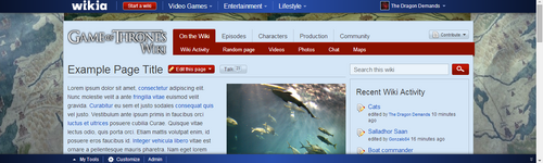
Sad it has come to this. lol. If someone wants to screencap the page now, this will be my entry...and can then make a blog if you want to have the community vote. QueenBuffy 19:42, August 13, 2014 (UTC) (Ok, here is my sample) File:QueenBuffy Sample Color.png
 17:28, August 7, 2014 (UTC)

 (talk) 18:44, August 8, 2014 (UTC)
 19:50, August 8, 2014 (UTC)
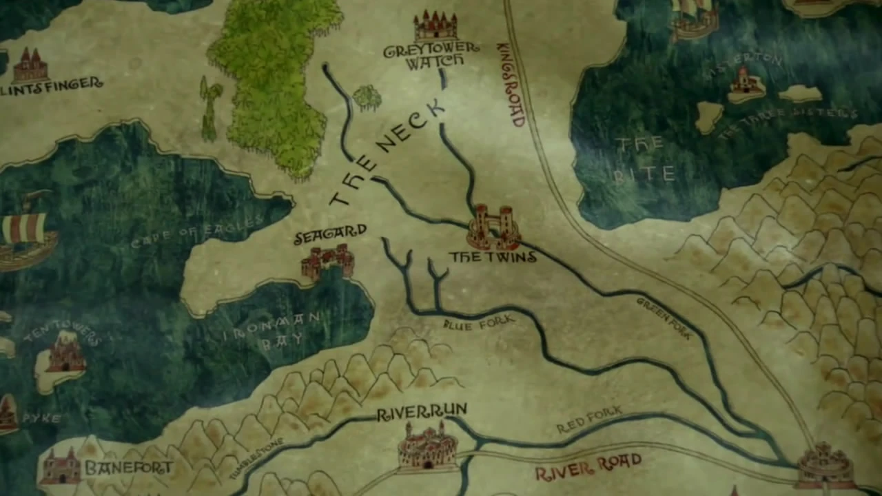


